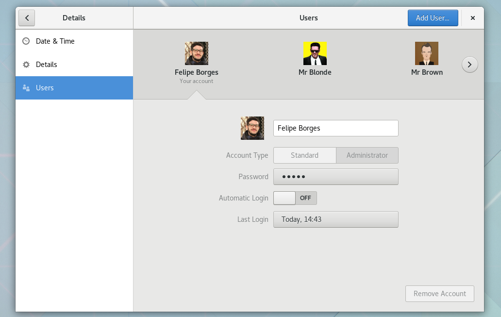
The GNOME Control Center redesign goes on. This release we are happy to announce the new Users Panel design. As you can see in the preview video below, we are moving away from a two column panel into a single page concept. These changes make the panel way clearer specially with the new shell.
In terms of user interface/experience, the Carousel is the main star of the new Users panel. It presents the system users, alphabetically sorted, three at the time. Its pagination allows browsing through the user list. The arrow indicates the selected item.
The Users panel now joins the Keyboard, Printers, and Mouse, as the new Settings experience. We plan to switch to the new Shell in the very next cycle. Stay tuned!