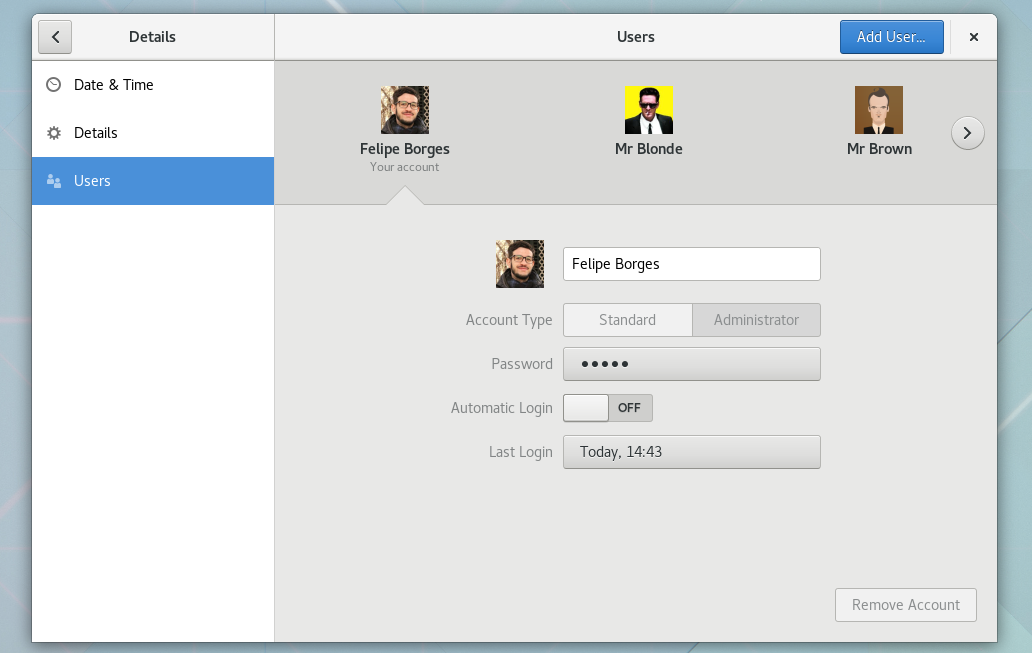
The GNOME Control Center redesign goes on. This release we are happy to announce the new Users Panel design. As you can see in the preview video below, we are moving away from a two column panel into a single page concept. These changes make the panel way clearer specially with the new shell.
In terms of user interface/experience, the Carousel is the main star of the new Users panel. It presents the system users, alphabetically sorted, three at the time. Its pagination allows browsing through the user list. The arrow indicates the selected item.
The Users panel now joins the Keyboard, Printers, and Mouse, as the new Settings experience. We plan to switch to the new Shell in the very next cycle. Stay tuned!
Does the interface have an alternate presentation for systems with a large number of users?
My thoughts also. At least it should have a search option.
This could be discussed. Could you please file a bug at bugzilla.gnome.org under control-center User Accounts? Thanks!
Good point
I also thought this, at least a search box it’s needed.
Great work!
Hi, thanks for your feedback. That’s a good point. It should handle large number of users normally, but if you want to do more stuff than just tweaking the Users, you should look at Fleet Commander.
Great work!
Also I love the Reservoir Dogs reference. :D
Looks good however to my eyes the arrow is a little of center within the button.
Sorry being a bit picky I know :-)
Does the design take scalability in any way?
I’ve used to manage a large-scale GNOME installation (a university) that had number of users in thousands scale (AFAIR it was around 2k).
Users were synced from Active Directory and we got into many places where nice designs failed miserably when faced with that number of users.
Please, please look into how your designs behave when there are 2k users on the system.
Hi, thanks for your reply. Maybe you should take a look at Fleet Commander for your use case.
https://wiki.gnome.org/Projects/FleetCommander
This may solve some problems. But still, it would be nice if the regular implementation doesn’t behave improperly when user in such managed environment wanders into this settings page.
E.g. it doesn’t allocate 2GB of RAM for all the sliding list entries or tries to get pictures for 2k users over the internet all at once.
It’s just a petition for designers to think outside the “me and my roommate on shared PC” box. Think about edge cases and how your designs/implementations behave when they happen before users get frustrated, not after.
It looks nice, but I personally find the waste of space on the top to be excessive.
Looks nice. But I thought horizontal-scrolling should be avoided, because it uncomfortable? Anyway I don’t think, that the most desktops will use more than two or three users (including ine), but if, this will be a pain to use.
I wouldn’t say that it is horizontal scrolling, it is paginated. But don’t take my word for it, test it and file bugs, please.
Since there are requirements to add users to groups for such things as scanners, Arduinos etc would you please add the ability to do this. It’s odd that a main function of an operating system is missing from GNOME.
Ask yourself, how does a new to Linux user even discover how to add themselves to a group? Nowhere in the GNOME desktop it seems. This is contrary to EVERY other Linux desktop available.
Thank you
Hi, that’s reasonable. But maybe you will find it better to manage these more advance settings with Fleet Commander instead.
Exciting!
[…] New Users Panel […]
[WORDPRESS HASHCASH] The comment’s server IP (204.68.122.2) doesn’t match the comment’s URL host IP (204.68.122.43) and so is spam.
[…] changes make the panel way clearer specially with the new shell,” said Felipe Borge in a recent blog post. “In terms of user interface/experience, the Carousel is the main star of the new Users […]
[WORDPRESS HASHCASH] The comment’s server IP (104.219.248.80) doesn’t match the comment’s URL host IP (104.219.248.83) and so is spam.
The music makes it :D nice job! Congrats fellow Russian hat colleague!
[…] the previous two-column interface, the single-page experience on the new users panel includes pagination that lets you easily move from one user to another. The panel also gets the keyboard, […]
[WORDPRESS HASHCASH] The comment’s server IP (67.205.17.216) doesn’t match the comment’s URL host IP (104.28.3.7) and so is spam.