Posted on

An update on GNOME Settings

There’s no question that GNOME Settings is important to the overall GNOME experience and I feel flattered to share the responsibility of being one of its maintainers. I have been involved with Settings for almost a decade now but only in the last few months I have  started to wear the general maintainer hat “officially”.

That’s why I am compelled to update our community on the current state of the project. Settings is also co-maintained by Robert Ancell who has been doing great work with reviews and also helping us improve our code readability/quality.

The last general update from Settings you might have heard of was Georges’ Maintainership of GNOME Settings Discourse post. Some of what’s written there still holds true: Settings is one of the largest modules in GNOME, and being this hub connecting the Shell, the settings daemons, network manager, portals, cups, etc… it needs more maintainers. It needs especially maintainers with domain expertise. We have a handful of active contributors doing great frontend/UI work,  but we lack active contributors with expertise in the deep dungeons of networking or color management, for example.

To tackle this issue, one of my goals is to improve the developer experience in GNOME Settings to attract new contributors and to enable drive-by contributors to post changes without struggling much with the process. For that, I kickstarted our Developer documentation. It is in an early stage now and welcoming contributions.

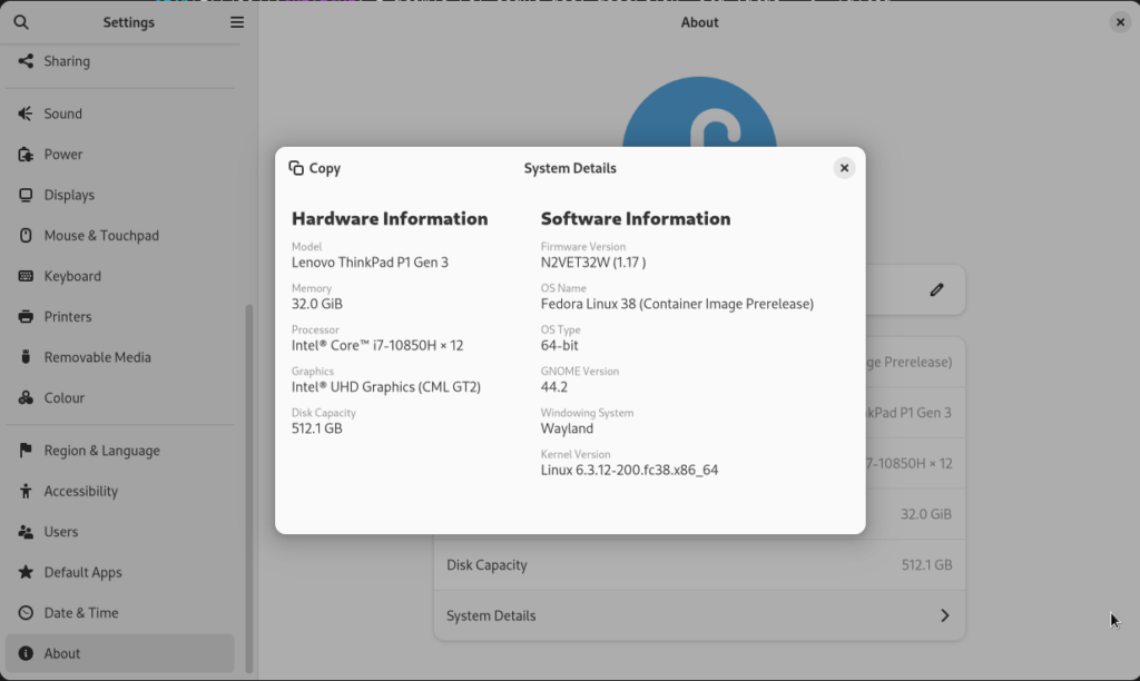
I also have been invested in fixing some of our historical UI consistency problems. A lot has been done in the gnome-44 and gnome-45 cycles to adopt the latest design patterns from the GNOME Human Interface Guidelines with libadwaita and modern GTK. Alice Mikhaylenko and Christopher Davis did an outstanding job with the ports to modern Adwaita navigation widgets. We also gained a new “About” panel that can condense more information that is useful especially for debugging/supporting issues. There’s still work to be done on this front especially with certain views that are currently looking a bit out of place in comparison to modern views.

Screenshot of the new "About" panel.

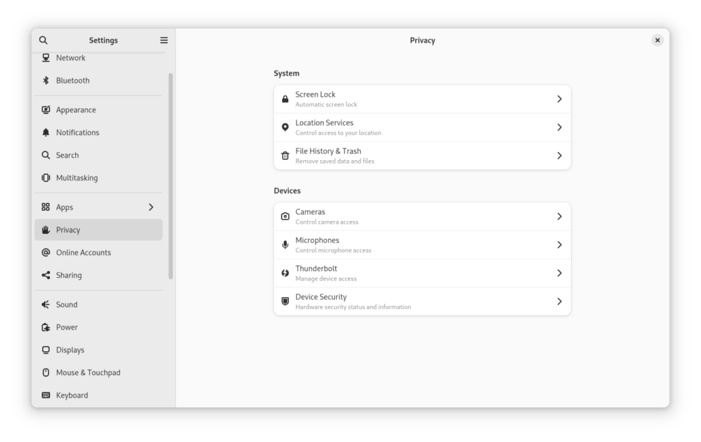
The new Privacy hub is a new “hub” panel introduced by Marco Melorio in gnome-45 that is our initial step towards reducing the overall number of panels.Screenshot of the new "Privacy" panel.For GNOME 46 we want to introduce a new “System” hub panel, developed by our Google Summer of Code intern Gotam Gorabh, as well as introduce a new “Network & Internet” panel that is being already worked on by contributor Inam Ul Haq. These are two epics that involve reworking some complicated panels such as the Wifi/Network and User Accounts ones. These are panels that should also see a big frontend rework in the gnome-46 cycle and that I plan to work on myself.

Also a big thank you to Allan Day, Jakub Steiner, Tobias Bernard, Sam Hewitt, and other folks doing outstanding design and UX work for Settings.

GNOME 45.0 (stable) will be released in September, shipping plenty of new stuff and bugfixes. It would be extremely helpful if you could test the latest changes and report issues and regressions in our issue tracker. GNOME Settings 45.rc has been released and should be available soon in GNOME OS and unstable/development distro releases such as Fedora Rawhide.

If you want to get involved, feel free to join our Matrix chat channel and ask questions there. I also monitor the “settings” Discourse tag, where you can ask support questions and suggest features.

Posted on 5 Comments

Revisiting the Printers Settings

If you read my announcement post or you are already running GNOME 3.24, you probably already know that there is a new Printers panel in GNOME Control Center. The new design is part of a big effort to modernize the Settings user interface.

After the 3.24 release we were able to gather more feedback from our users and, this way, cook up some improvements/enhancements to better suit their use-cases.

The main concern raised after the release was the discoverability of a printer in the list of printers. To tackle these issues we introduced two new features:

Search

Show recently added printer

yep, that’s a gif.

Another must-have feature that the printers panel never had and now is merged is the ability to undo a deletion of a printer.

Some users found it irrelevant to show the ink level bar when there’s no ink information to show, in doing so, we decided to hide it entirely for these cases.

In conclusion, it is worth mentioning that “Software is Never Done“. This is an evolving work which depends on various factors, including your feedback. Please, report bugs, suggest enhancements, and write patches, to make our desktop always better.

Posted on 21 Comments

New Users Panel

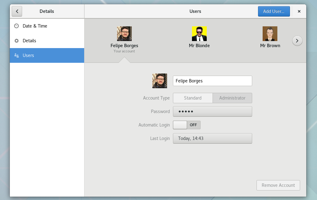
The GNOME Control Center redesign goes on. This release we are happy to announce the new Users Panel design. As you can see in the preview video below, we are moving away from a two column panel into a single page concept. These changes make the panel way clearer specially with the new shell.

In terms of user interface/experience, the Carousel is the main star of the new Users panel. It presents the system users, alphabetically sorted, three at the time. Its pagination allows browsing through the user list. The arrow indicates the selected item.

The Users panel now joins the Keyboard, Printers, and Mouse, as the new Settings experience. We plan to switch to the new Shell in the very next cycle. Stay tuned!


Posted on 43 Comments

New Mouse & Touchpad Panel

New Mouse & Touchpad panel

GNOME Control Center is getting a new design in the near future, but firstly we need to port the panels to match the new concept. Thus I have been working on the new Mouse & Touchpad panel.

The Test Your Settings dialog is now presented within the control-center window.

What’s interesting about this concept — besides of the fresh and minimalist look & feel — is that it only shows relevant settings to you. So, for instance, it won’t have a Touchpad section if you don’t have a supported touchpad device, and so on…

Some of you might miss the double-click delay setting that used to belong to the Mouse & Touchpad panel. Don’t worry, it is now part of the Universal Access panel.

Z7mgqTl

This changes are already on master and will be included in our next release, GNOME 3.20.

After that I will be tackling the Keyboards panel. The goal is to have all panels ready for the new Control Center shell.

Posted on 9 Comments

New printer Jobs Dialog

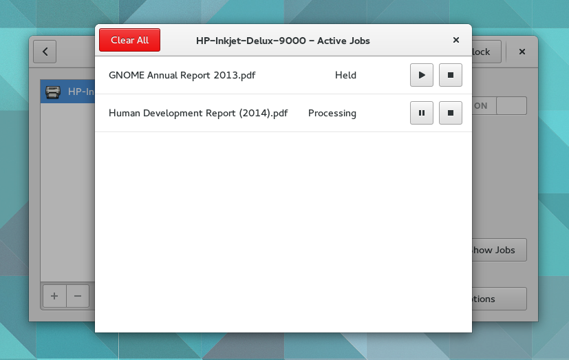
pp-jobs-dialog-screenshotIn my first week at Red Hat I started working on the Printers panel on GNOME Control Center. My first task was to rewrite the printer Jobs dialog to match the newest mockups at https://wiki.gnome.org/Design/SystemSettings/Printers

Talk is cheap, so look at the screencast below:

ps.: since it is a big UI change and we’re close to a release, this new design will probably feature gnome 3.20.

Development branch: https://git.gnome.org/browse/gnome-control-center/log/?h=wip/feborges/new-printers-panel